CEDRIC GUERIN
loader

Obsidian

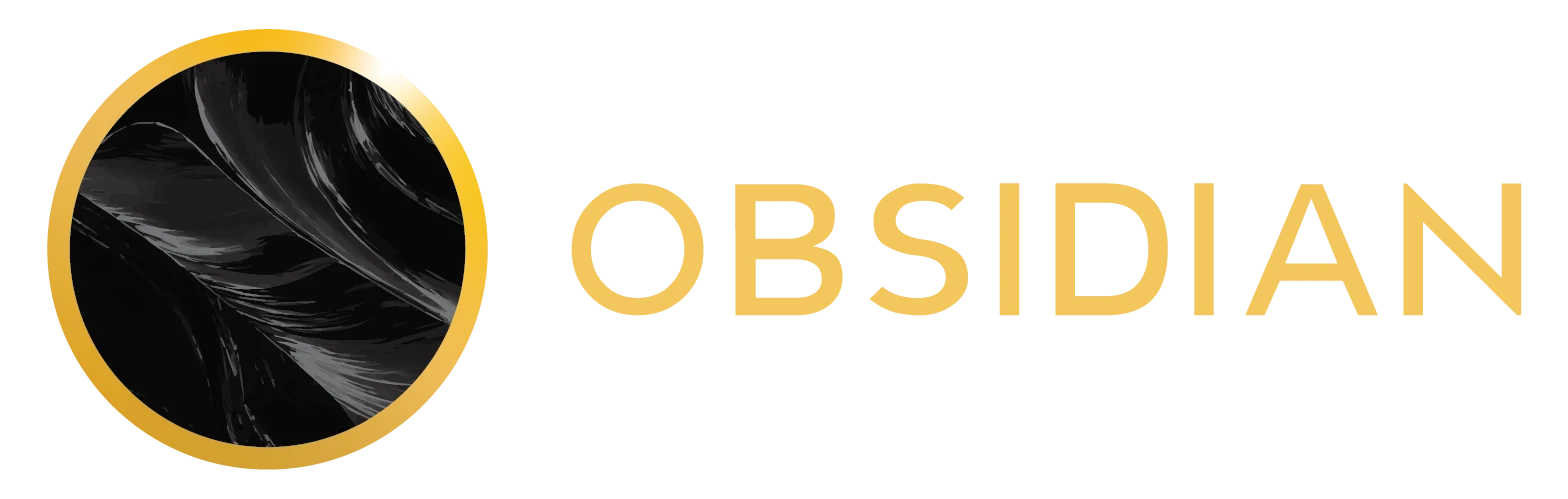
Built on character. Powered by connection. I created the full brand identity and design for Obsidian, a membership collective founded on shared knowledge, earned respect, and the strength of its network. Inspired by volcanic glass forged under pressure, the identity pairs a sculptural mark with a restrained black-and-gold palette, distinctive typography, and cinematic imagery. From the logo and visual language to the brand guidelines and collateral, every element expresses the same idea: your network is your edge.

  • CLIENT OBSIDIAN
  • CATEGORY BRAND IDENTITY / DESIGN
Obsidian gold symbol and wordmark

Forged in the fire.

The identity draws its strength from obsidian: a material shaped by intense pressure and transformation. That idea became the foundation for a visual world built around resilience, purpose, and the power of the people around you.
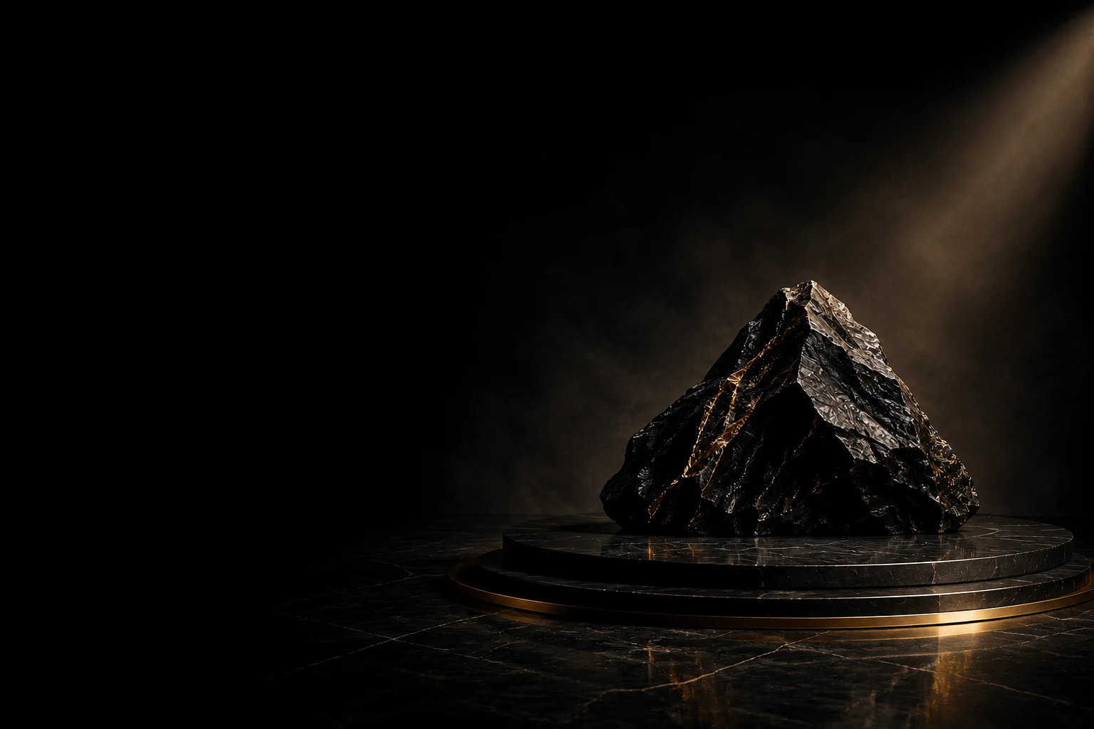
Dramatically lit volcanic obsidianObsidian visual direction with sculptural forms, black stone, and gold accents

A distinct visual language.

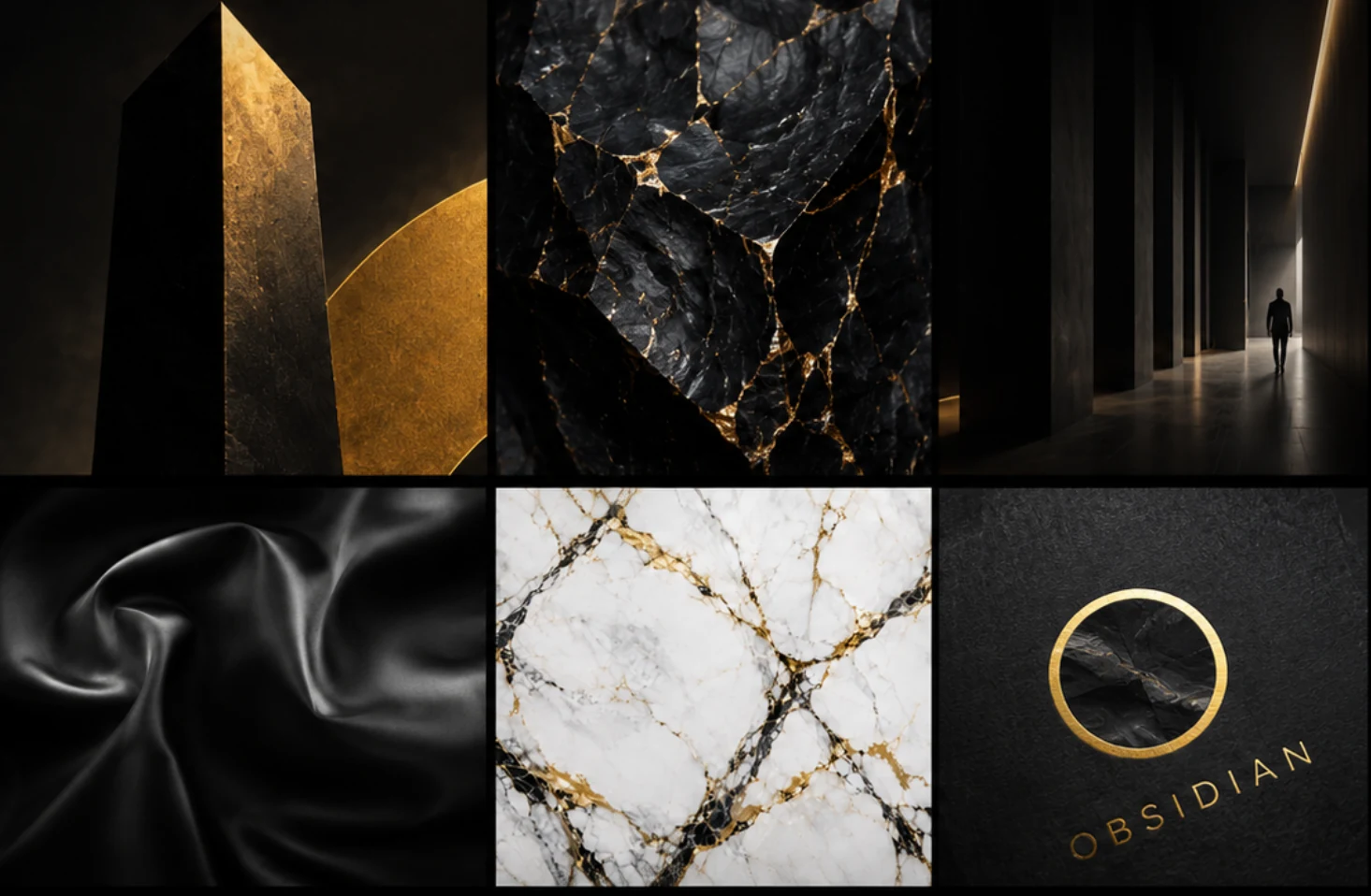
A sculptural mark, warm gold, and deep mineral tones balance confidence with restraint. Berlin and Inter create a clear typographic hierarchy, while cinematic imagery gives the brand a sense of scale, texture, and quiet strength.
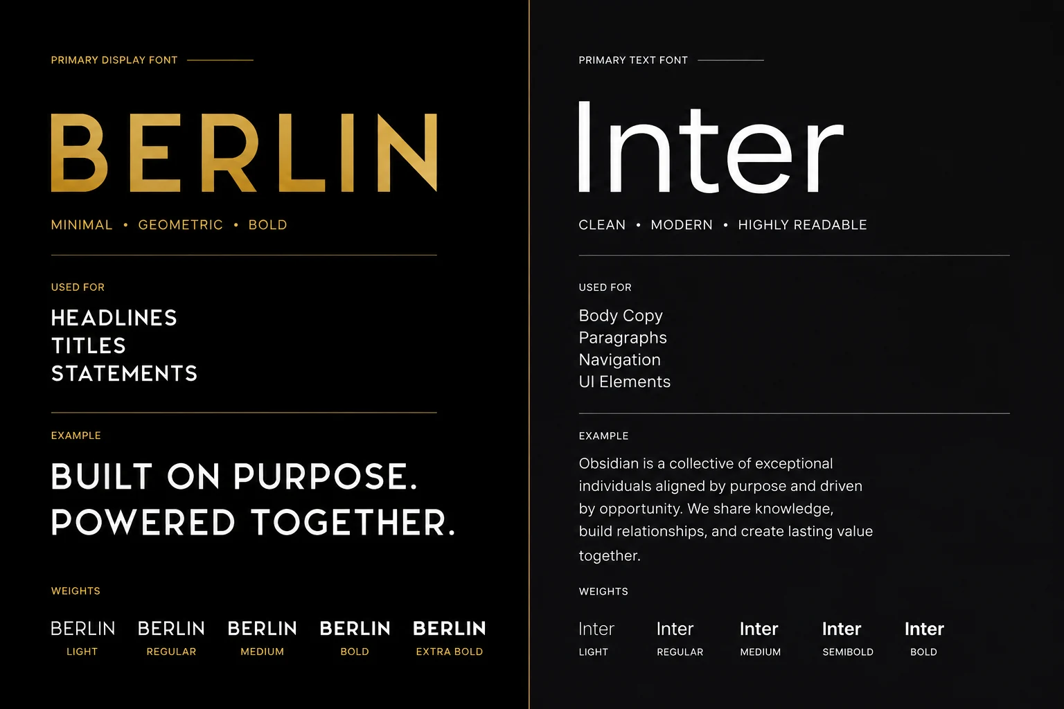
Obsidian typography system: Berlin and Inter. Built on purpose. Powered together.
#F3C65D
#000000
#18232B
#34473F
#FFFFFF
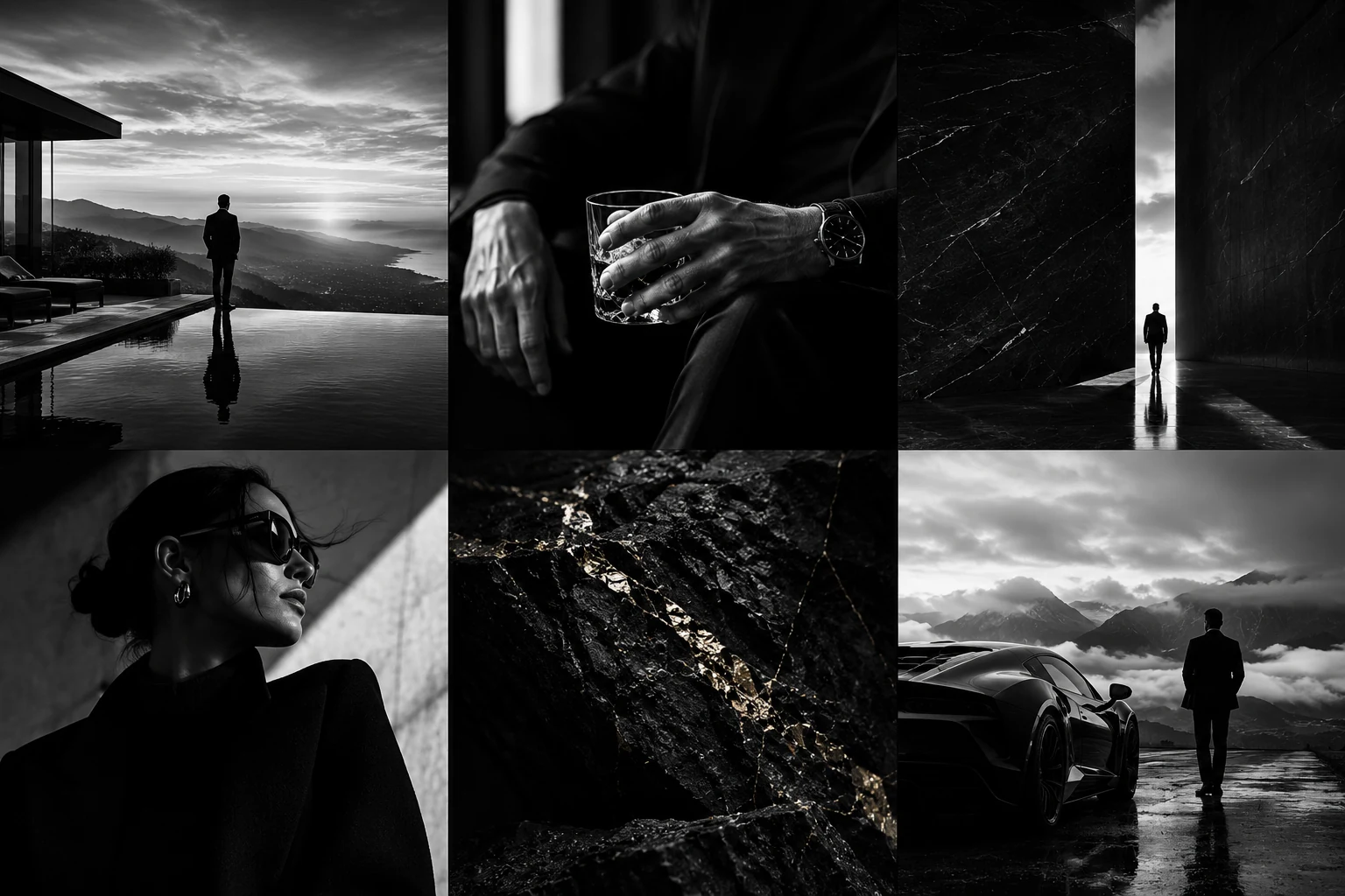
Black-and-white Obsidian lifestyle photography and architectural imagery

One identity. Every touchpoint.

I carried the design across the full identity system and brand guidelines, with collateral concepts showing how the brand comes to life. Consistent typography, materials, and details connect each application back to a single, recognizable point of view.
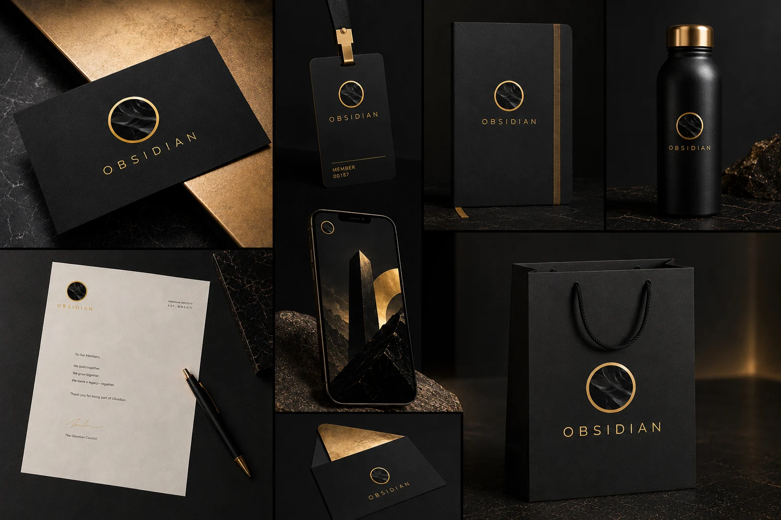
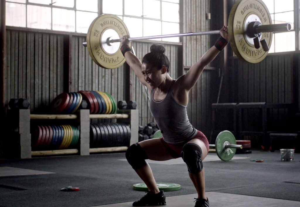
Obsidian identity applications across stationery, business cards, packaging, and branded objects
  • MORE WORKS MORE WORKS
  • MORE WORKS MORE WORKS
  • MORE WORKS MORE WORKS
  • MORE WORKS MORE WORKS